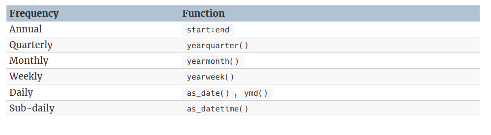
Chapter 2 Time series graphics
2.1 tsibble objects
x <- tsibble(Year = 2015:2019, Observation = c(123, 39, 78, 52, 110),
             index = Year)

x
#> # A tsibble: 5 x 2 [1Y]
#>    Year Observation
#>   <int>       <dbl>
#> 1  2015         123
#> 2  2016          39
#> 3  2017          78
#> 4  2018          52
#> 5  2019         110
Multiple time series, key:
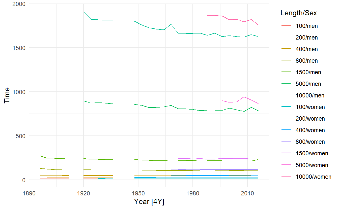
olympic_running
#> # A tsibble: 312 x 4 [4Y]
#> # Key:       Length, Sex [14]
#>    Year Length Sex    Time
#>   <int>  <int> <chr> <dbl>
#> 1  1896    100 men    12
#> 2  1900    100 men    11
#> 3  1904    100 men    11
#> 4  1908    100 men    10.8
#> 5  1912    100 men    10.8
#> 6  1916    100 men    NA
#> # ... with 306 more rows
key must be specified in one of the following form:
2.1.1 manipulation
tidyverse-based manipulation
PBS
#> # A tsibble: 65,219 x 9 [1M]
#> # Key:       Concession, Type, ATC1, ATC2 [336]
#>      Month Concession  Type   ATC1  ATC1_desc    ATC2  ATC2_desc   Scripts  Cost
#>      <mth> <chr>       <chr>  <chr> <chr>        <chr> <chr>         <dbl> <dbl>
#> 1 1991 Jul Concession~ Co-pa~ A     Alimentary ~ A01   STOMATOLOG~   18228 67877
#> 2 1991 Aug Concession~ Co-pa~ A     Alimentary ~ A01   STOMATOLOG~   15327 57011
#> 3 1991 Sep Concession~ Co-pa~ A     Alimentary ~ A01   STOMATOLOG~   14775 55020
#> 4 1991 Oct Concession~ Co-pa~ A     Alimentary ~ A01   STOMATOLOG~   15380 57222
#> 5 1991 Nov Concession~ Co-pa~ A     Alimentary ~ A01   STOMATOLOG~   14371 52120
#> 6 1991 Dec Concession~ Co-pa~ A     Alimentary ~ A01   STOMATOLOG~   15028 54299
#> # ... with 65,213 more rows

PBS %>%
  filter(ATC2 == "A10")
#> # A tsibble: 816 x 9 [1M]
#> # Key:       Concession, Type, ATC1, ATC2 [4]
#>      Month Concession  Type   ATC1  ATC1_desc    ATC2  ATC2_desc  Scripts   Cost
#>      <mth> <chr>       <chr>  <chr> <chr>        <chr> <chr>        <dbl>  <dbl>
#> 1 1991 Jul Concession~ Co-pa~ A     Alimentary ~ A10   ANTIDIABE~   89733 2.09e6
#> 2 1991 Aug Concession~ Co-pa~ A     Alimentary ~ A10   ANTIDIABE~   77101 1.80e6
#> 3 1991 Sep Concession~ Co-pa~ A     Alimentary ~ A10   ANTIDIABE~   76255 1.78e6
#> 4 1991 Oct Concession~ Co-pa~ A     Alimentary ~ A10   ANTIDIABE~   78681 1.85e6
#> 5 1991 Nov Concession~ Co-pa~ A     Alimentary ~ A10   ANTIDIABE~   70554 1.69e6
#> 6 1991 Dec Concession~ Co-pa~ A     Alimentary ~ A10   ANTIDIABE~   75814 1.84e6
#> # ... with 810 more rows

# index column is automatically selected
PBS %>%
  filter(ATC2=="A10") %>%
  select(Concession, Type, ATC1)
#> # A tsibble: 816 x 4 [1M]
#> # Key:       Concession, Type, ATC1 [4]
#>   Concession   Type        ATC1     Month
#>   <chr>        <chr>       <chr>    <mth>
#> 1 Concessional Co-payments A     1991 Jul
#> 2 Concessional Co-payments A     1991 Aug
#> 3 Concessional Co-payments A     1991 Sep
#> 4 Concessional Co-payments A     1991 Oct
#> 5 Concessional Co-payments A     1991 Nov
#> 6 Concessional Co-payments A     1991 Dec
#> # ... with 810 more rows
All key variable must be explicitly selected, that means we must at least select Concession and Type in the case above, since ATC2 and ATC1 are no longer key variables after filter(ATC == "A10")
PBS %>%
    filter(ATC2 == "A10") %>%
    as_tibble() %>%
    count(Concession, Type, ATC1)
#> # A tibble: 4 x 4
#>   Concession   Type        ATC1      n
#>   <chr>        <chr>       <chr> <int>
#> 1 Concessional Co-payments A       204
#> 2 Concessional Safety net  A       204
#> 3 General      Co-payments A       204
#> 4 General      Safety net  A       204
As to summarize(), index is automatically used as the grouping variable:
PBS %>%
  filter(ATC2 == "A10") %>%
  select(Month, Concession, Type, Cost) %>%
  summarise(total_cost = sum(Cost))
#> # A tsibble: 204 x 2 [1M]
#>      Month total_cost
#>      <mth>      <dbl>
#> 1 1991 Jul    3526591
#> 2 1991 Aug    3180891
#> 3 1991 Sep    3252221
#> 4 1991 Oct    3611003
#> 5 1991 Nov    3565869
#> 6 1991 Dec    4306371
#> # ... with 198 more rows
The mutate(), here we change the units from dollars to millions of dollars:
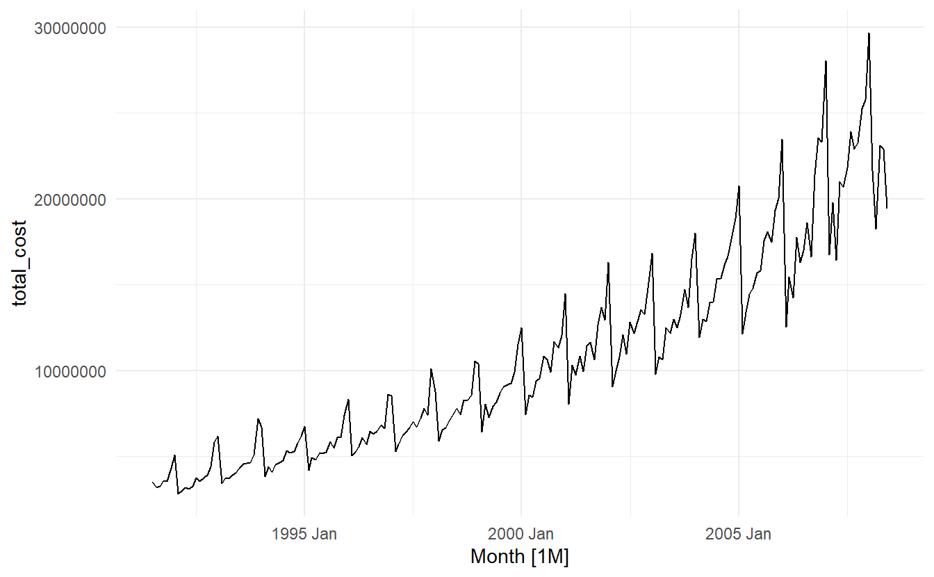
PBS %>%
  filter(ATC2 == "A10") %>%
  select(Month, Concession, Type, Cost) %>%
  summarise(total_cost = sum(Cost)) %>%
  mutate(cost = total_cost / 1e6) -> a10

a10
#> # A tsibble: 204 x 3 [1M]
#>      Month total_cost  cost
#>      <mth>      <dbl> <dbl>
#> 1 1991 Jul    3526591  3.53
#> 2 1991 Aug    3180891  3.18
#> 3 1991 Sep    3252221  3.25
#> 4 1991 Oct    3611003  3.61
#> 5 1991 Nov    3565869  3.57
#> 6 1991 Dec    4306371  4.31
#> # ... with 198 more rows
2.1.2 importing
prison <- vroom::vroom("https://OTexts.com/fpp3/extrafiles/prison_population.csv")

prison <-  prison %>%
  mutate(quarter = yearquarter(Date)) %>%
  select(-Date) %>%
  as_tsibble(key = c(State, Gender, Legal, Indigenous), index = quarter)

prison
#> # A tsibble: 3,072 x 6 [1Q]
#> # Key:       State, Gender, Legal, Indigenous [64]
#>   State Gender Legal    Indigenous Count quarter
#>   <chr> <chr>  <chr>    <chr>      <dbl>   <qtr>
#> 1 ACT   Female Remanded ATSI           0 2005 Q1
#> 2 ACT   Female Remanded ATSI           1 2005 Q2
#> 3 ACT   Female Remanded ATSI           0 2005 Q3
#> 4 ACT   Female Remanded ATSI           0 2005 Q4
#> 5 ACT   Female Remanded ATSI           1 2006 Q1
#> 6 ACT   Female Remanded ATSI           1 2006 Q2
#> # ... with 3,066 more rows
2.2 Time plots
(melsyd_economy <- ansett %>%
  filter(Airports == "MEL-SYD", Class == "Economy"))
#> # A tsibble: 282 x 4 [1W]
#> # Key:       Airports, Class [1]
#>       Week Airports Class   Passengers
#>     <week> <chr>    <chr>        <dbl>
#> 1 1987 W26 MEL-SYD  Economy      20167
#> 2 1987 W27 MEL-SYD  Economy      20161
#> 3 1987 W28 MEL-SYD  Economy      19993
#> 4 1987 W29 MEL-SYD  Economy      20986
#> 5 1987 W30 MEL-SYD  Economy      20497
#> 6 1987 W31 MEL-SYD  Economy      20770
#> # ... with 276 more rows

melsyd_economy %>%
  autoplot(Passengers) +
labs(title = "Ansett economy class passengers", subtitle = "Melbourne-Sydney", x = "Year") 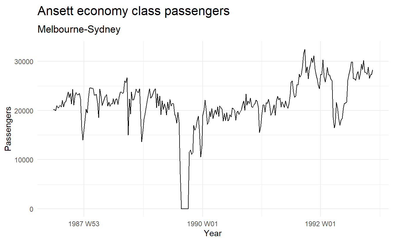
autoplot() automatically produces an appropriate plot of whatever you pass to it in the first argument.
When there are multiple time series in a tsibble(), they are plotted separately:
2.3 Patterns of time series: trend, seasonal and cyclic
Trend:
A trend exists when there is a long-term increase or decrease in the data. It does not have to be linear. Sometimes we will refer to a trend as “changing direction”, when it might go from an increasing trend to a decreasing trend.
Seasonal:
A seasonal pattern occurs when a time series is affected by seasonal factors such as the time of the year or the day of the week. Seasonality is always of a fixed and known period(within a season, a year, etc.).
Cyclic:
A cycle occurs when the data exhibit rises and falls that are not of a fixed frequency. These fluctuations are usually due to economic conditions, and are often related to the “business cycle”. The duration of these fluctuations is usually at least 2 years.
Many people confuse cyclic behaviour with seasonal behaviour, but they are really quite different. If the fluctuations are not of a fixed frequency then they are cyclic; if the frequency is unchanging and associated with some aspect of the calendar, then the pattern is seasonal. In general, the average length of cycles is longer than the length of a seasonal pattern, and the magnitudes of cycles tend to be more variable than the magnitudes of seasonal patterns.
(As we will see soon, gg_season() provides a useful tool in distinguishing between seasonal and cyclic patterns.)
It’s crucial to first identify the time series patterns in the data, and then choose a method that is able to capture the patterns properly.
An example of combined patterns:
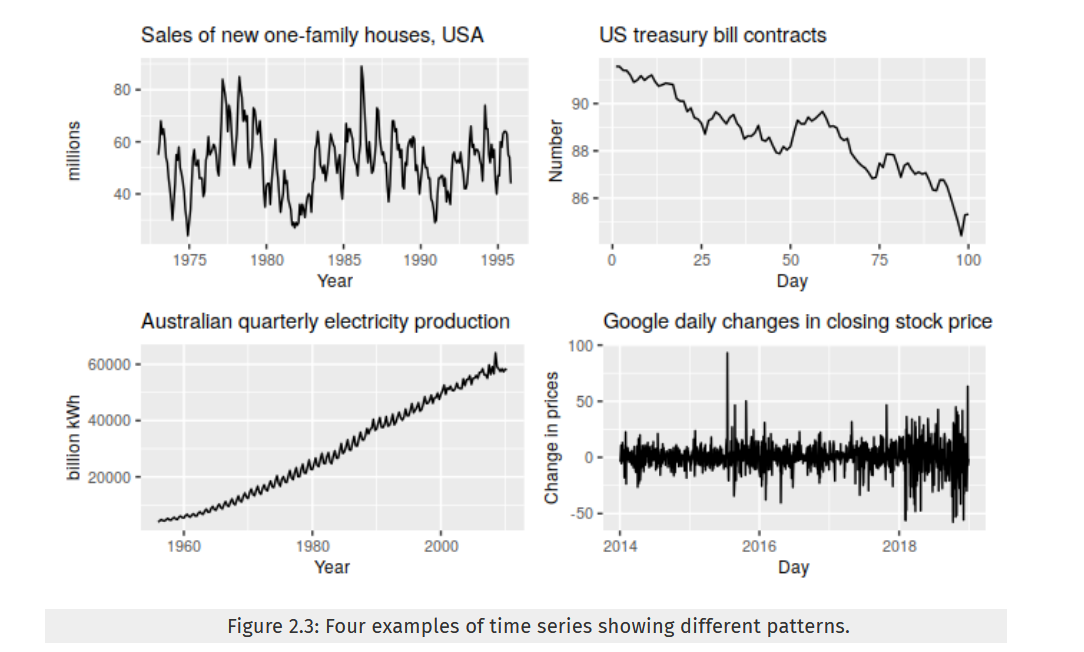
- topleft: storng seasonality, cyclic period in 6 - 10 years, no trend
- topright: decreasing trend, no trend or cyclic
- bottomleft: increasing trend, seasonality (perhaps on a yearly basis?)
- bottomright: random fluctuation
2.4 Seasonal plots
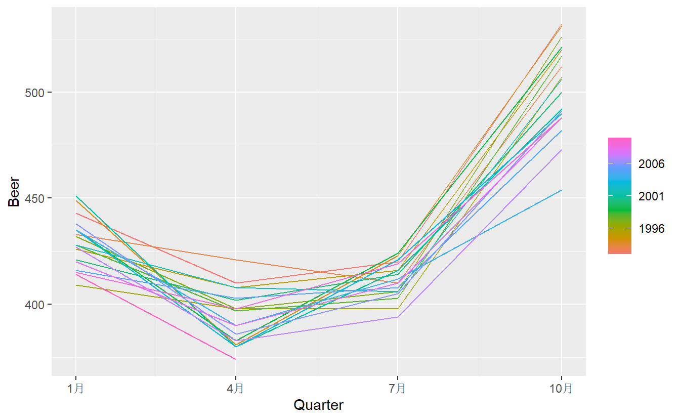
A seasonal plot is similar to a time plot except that the data are plotted against the individual “seasons” in which the data were observed. A seasonal plot allows the underlying seasonal pattern to be seen more clearly, and is especially useful in identifying years in which the pattern changes.
# y can be automatically chosen
a10 %>% gg_season(y = cost, labels = "both") +
  ylab("$ million") +
ggtitle("Seasonal plot: antidiabetic drug sales") 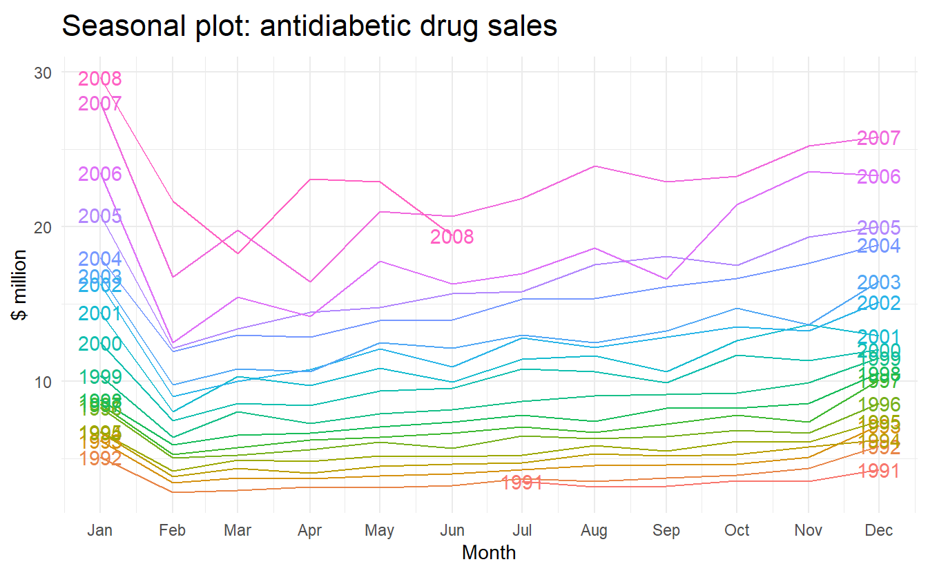
Here labels = "both" means labels of years are displayed on both sides of the plot.
In this case, it is clear that there is a plummet in sales in January each year. And there is an aberrant decrease in March 2008, since most years would see an increase from Feb to Mar.
A way to reproduce the plot generated by gg_season():
a10 %>%
  mutate(month = month(Month),
         year = year(Month)) %>%  # accessor function from lubridate package
  as_tibble() %>%
  group_by(year, month) %>%
  summarize(cost = sum(cost)) %>%
  ggplot() +
  geom_line(aes(month, cost, color = year, group = year))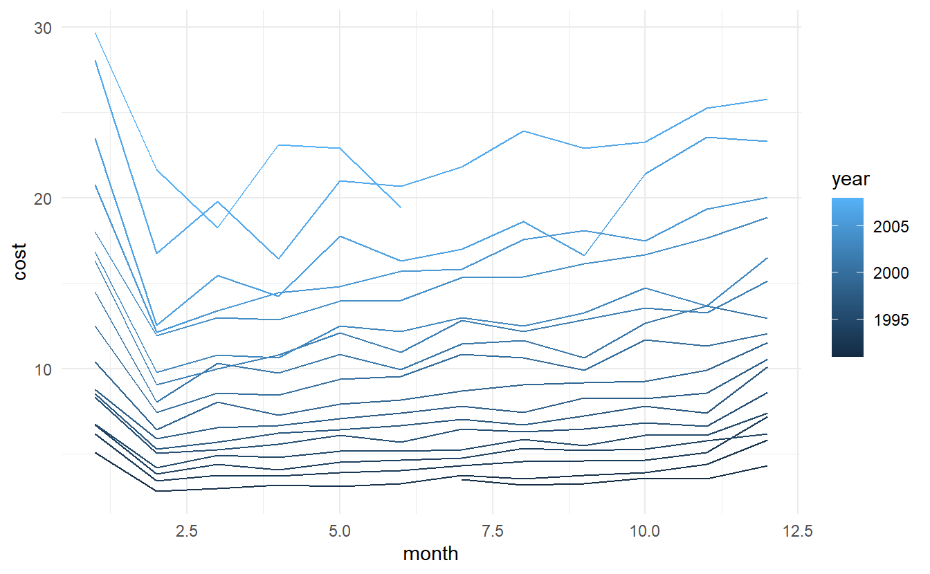
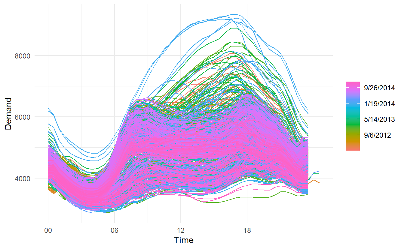
2.4.1 Multiple seasonal periods: period in gg_season()
Where the data has more than one seasonal pattern, the period argument can be used to select which seasonal plot is required. The vic_elec data contains half-hourly electricity demand for the state of Victoria, Australia. We can plot the daily pattern, weekly pattern or yearly pattern as follows.
daily:
weekly:
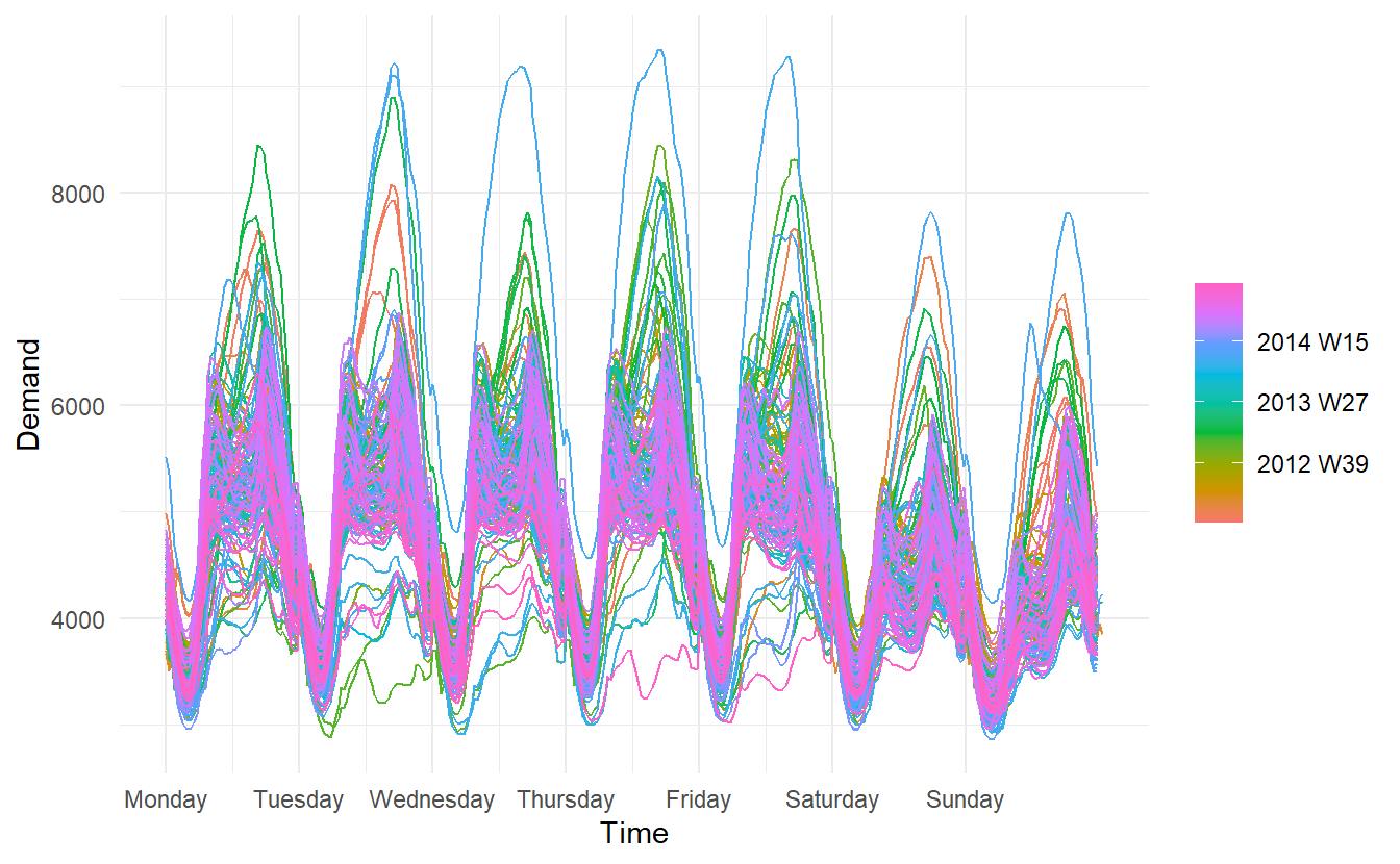
yearly:
# this plot in fact contains 4 lines
vic_elec %>%
  gg_season(period = "year") +
  theme(legend.position = "top")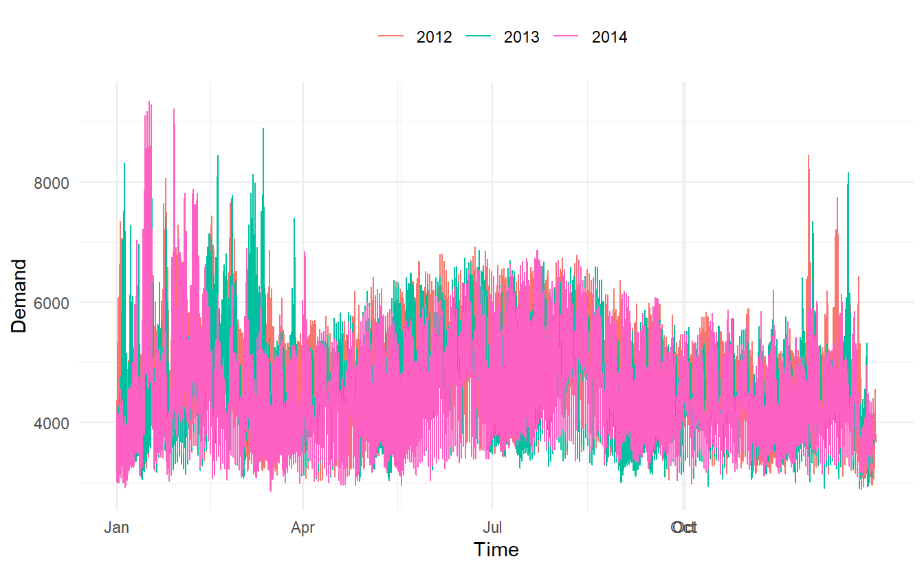
Different from autoplot(), when gg_season() and the gg_subseries() (later introduced) encounter multiple time series, they are displayed in facets.
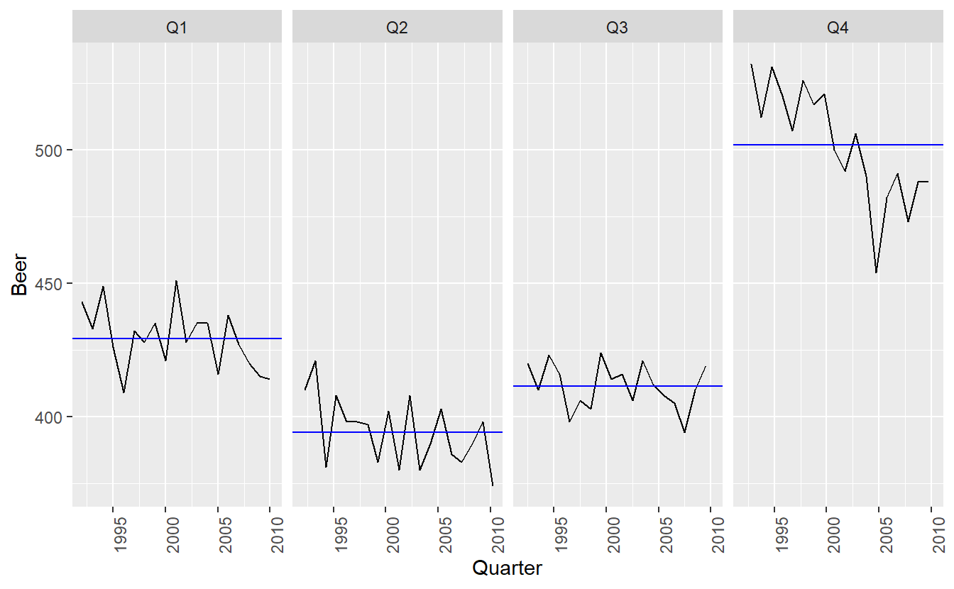
2.5 Seasonal subseries plots
An alternative plot that emphasises the seasonal patterns is where the data for each season are collected together by facet.
a10 %>%
  gg_subseries(cost) +
    ylab("$ million") +
    xlab("Year") +
    ggtitle("Seasonal subseries plot: antidiabetic drug sales")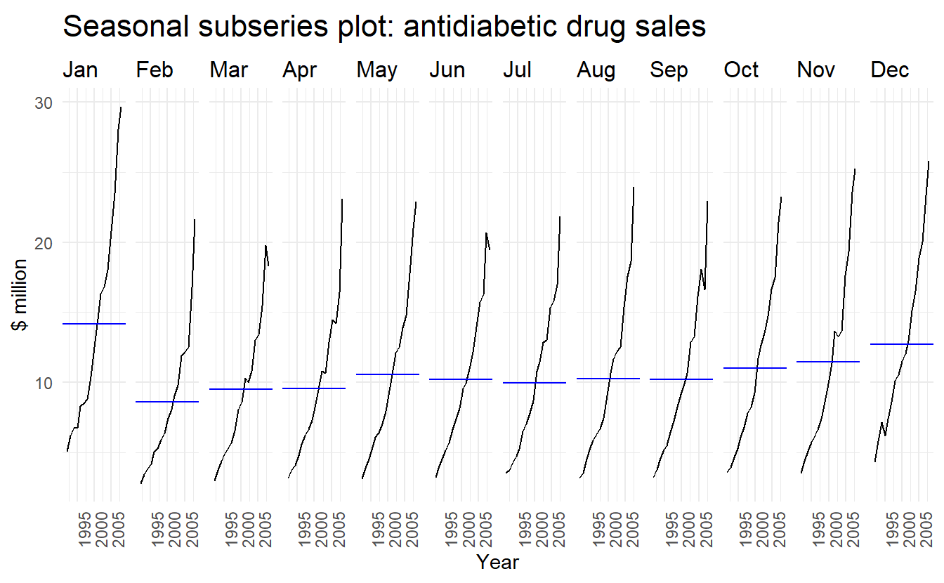
The blue horizontal lines indicate the means for each month. This form of plot enables the underlying seasonal pattern to be seen clearly, and also shows the changes in seasonality over time. It is especially useful in identifying changes within particular seasons. In this example, the plot is not particularly revealing; but in some cases, this is the most useful way of viewing seasonal changes over time.
2.5.1 Example: Australian holiday tourism
holiday_tourism contains holiday tourists from 1998 to 2017, deaggregated by Region, State:
holiday_tourism <- tourism %>%
  filter(Purpose == "Holiday") %>%
  select(-Purpose)

holiday_tourism
#> # A tsibble: 6,080 x 4 [1Q]
#> # Key:       Region, State [76]
#>   Quarter Region   State           Trips
#>     <qtr> <chr>    <chr>           <dbl>
#> 1 1998 Q1 Adelaide South Australia  224.
#> 2 1998 Q2 Adelaide South Australia  130.
#> 3 1998 Q3 Adelaide South Australia  156.
#> 4 1998 Q4 Adelaide South Australia  182.
#> 5 1999 Q1 Adelaide South Australia  185.
#> 6 1999 Q2 Adelaide South Australia  135.
#> # ... with 6,074 more rows
Then we can get total visitors by states(i.e., ignoring regions), and then plot it using autoplot(), note this is a multiple time series:
holidays <- holiday_tourism %>%
  group_by(State) %>% # no need for group_by(Quarter, Region)
  summarize(trips = sum(Trips)) %>%
  ungroup()

holidays %>%
  autoplot() +
  labs(x = "Year", y = NULL,
       title = "Australian domestic holiday nights",
       subtitle = "y: Thousands of trips")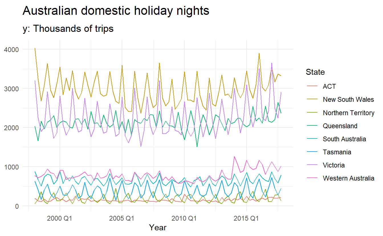
Time plots of each series shows that there is strong seasonality for most states, but that the seasonal peaks do not coincide.
To see the timing of the seasonal peaks in each state, we can use a season plot.
holidays %>%
  gg_season(trips) +
  labs(y = NULL, title = "Australian domestic holiday nights",
       subtitle = "y: Thousands of trips")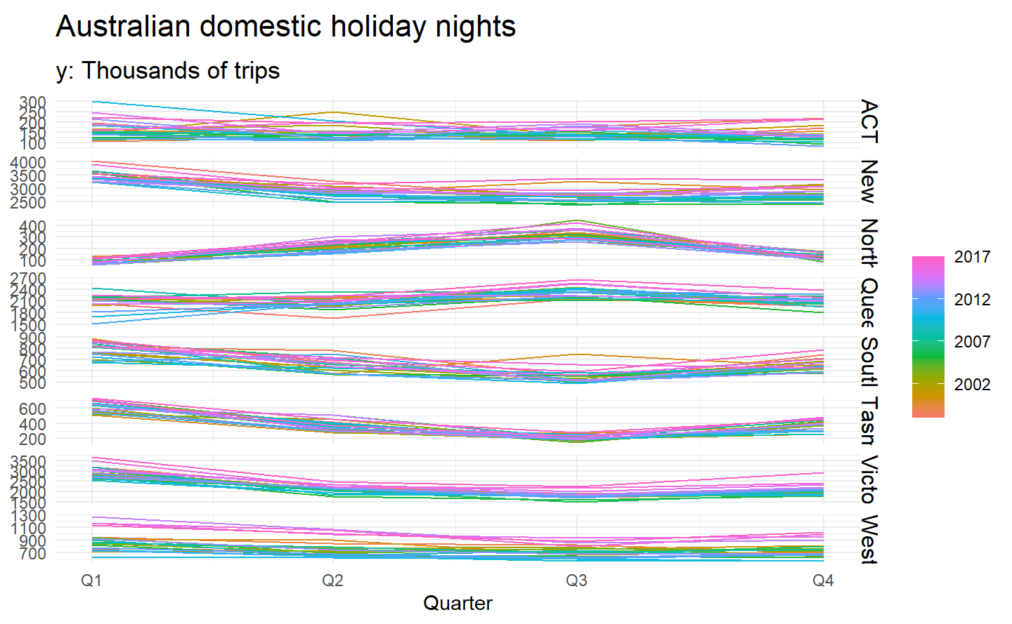
Here it is clear that the southern states of Australia (Tasmania, Victoria and South Australia) have strongest tourism in Q1 (their summer), while the northern states (Queensland and the Northern Territory) have the strongest tourism in Q3 (their dry season).
The corresponding subseries plots are shown below:
holidays %>%
  gg_subseries(trips) +
  labs(y = NULL, title = "Australian domestic holiday nights",
       subtitle = "y: Thousands of trips")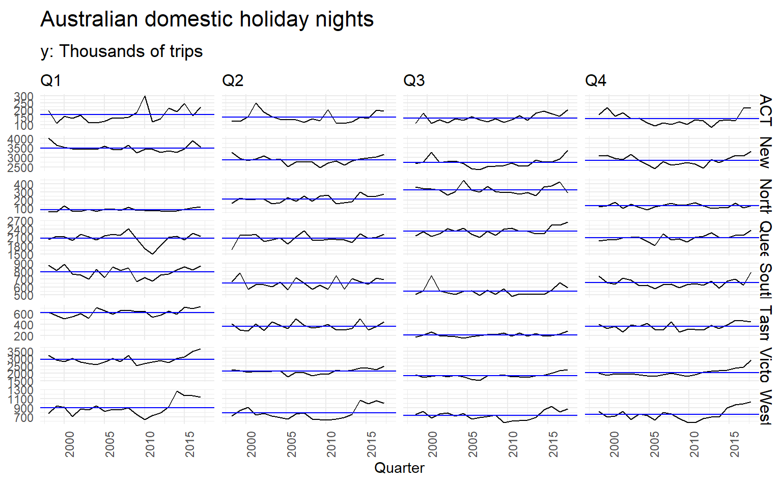
This figure makes it evident that Western Australian tourism has jumped markedly in recent years, while Victorian tourism has increased in Q1 and Q4 but not in the middle of the year.
2.6 Visualization between time series
While autoplot(), gg_season() and gg_subseries() is instrumental in visualizing individual time series, it is also useful to explore relationships between time series.
vic_elec half-hourly electricity Demand (in Gigawatts) and Temperature (in degrees Celsius), for 2014 in Victoria, Australia. The temperatures are for Melbourne, the largest city in Victoria, while the demand values are for the entire state. Addition to draw two separate time series, we can make a scatter plot to see relationship between the two:
library(ggpointdensity)
vic_elec %>%
  ggplot() +
  geom_pointdensity(aes(Demand, Temperature)) +
  scale_color_viridis_c()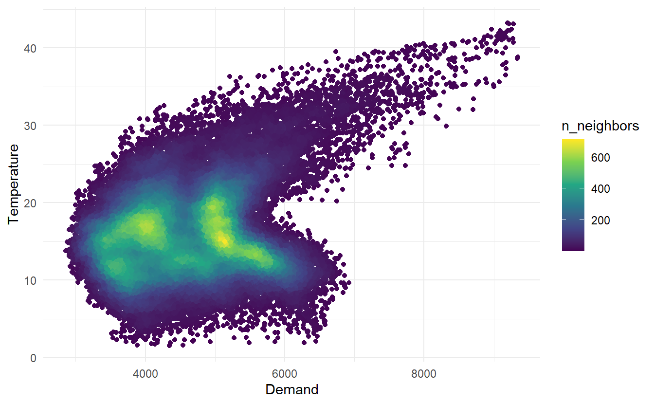
2.6.1 scatterplot matrices
When there are several potential predictor variables, it is useful to plot each variable against each other variable. Consider the eight time series shown below, showing quarterly visitor numbers across states and territories of Australia.
visitors <- tourism %>%
group_by(State) %>%
summarize(trips = sum(Trips))
visitors %>%
ggplot(aes(x = Quarter, y = trips)) +
geom_line() +
facet_grid(vars(State), scales = "free_y") +
labs(title = "Number of visitor nights each quarter (millions)")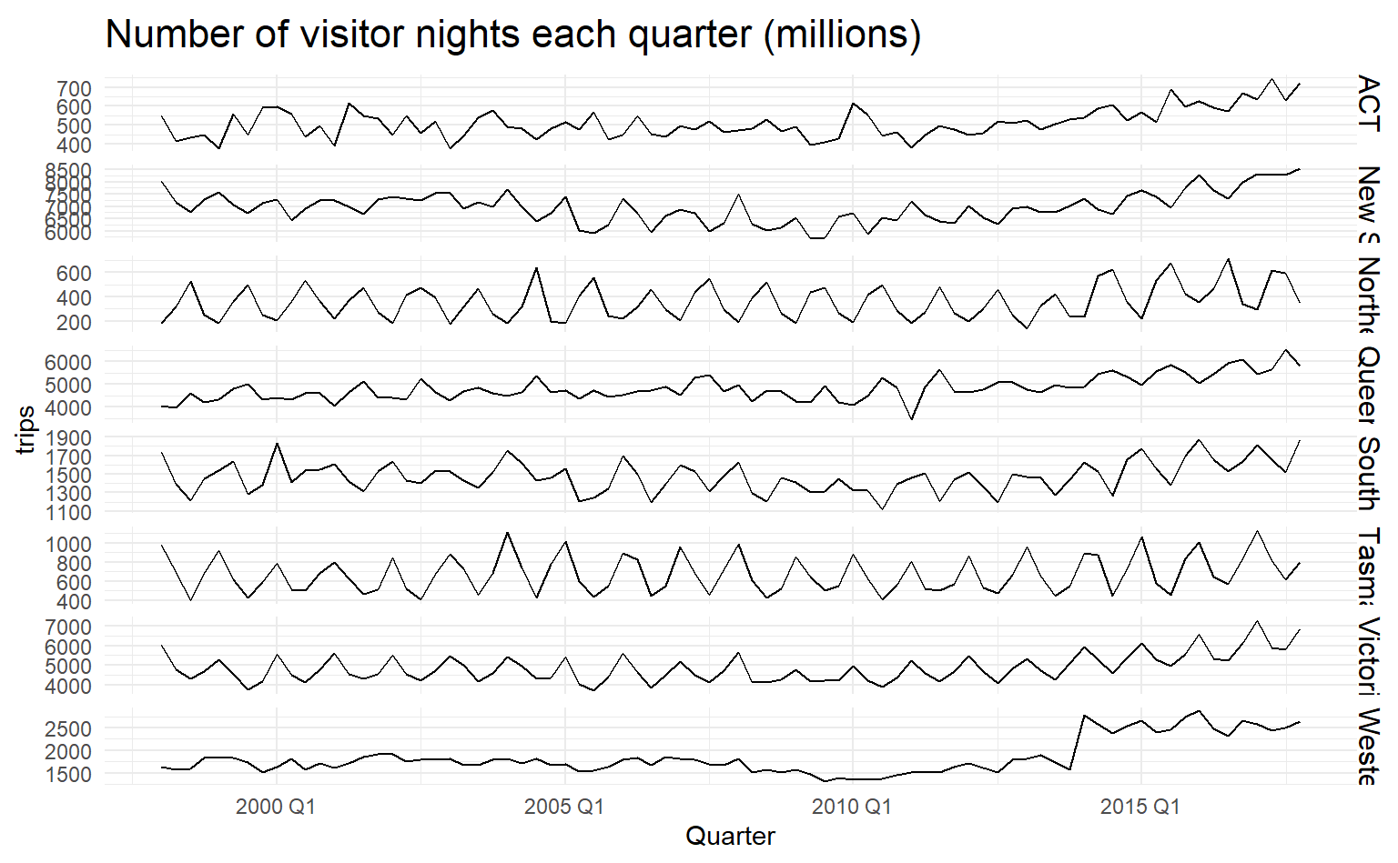 To better illustrate how number of visitors in different states are related, we could draw a scatterplot matrix by
 GGally;:ggpairs()
library(GGally)
visitors %>%
  pivot_wider(names_from = State, values_from = trips) %>%
  ggpairs(columns = 2:9)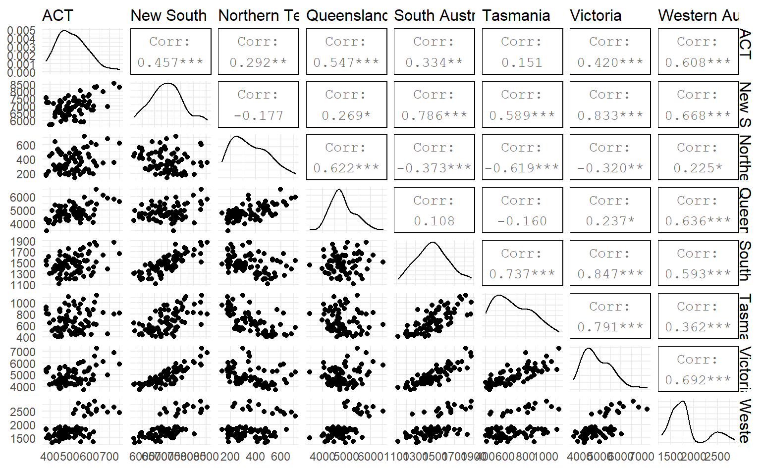
2.7 Lag plots
Lag plot is another useful tool in discerning seaonality, which display \(y_t\) against \(y_{t-k}\) in a time series, \(k\) being a constant for each individual plot.
Here we use the Australian beer production data to make a lag plot, in gg_lag(), lags determines different values of \(k\) displayed (defaults to 1:9) and geom types of geometry:
recent_production <- aus_production %>%
  filter(year(Quarter) >= 1992)

recent_production %>%
  gg_lag(y = Beer, lags = 1:9, geom = "point")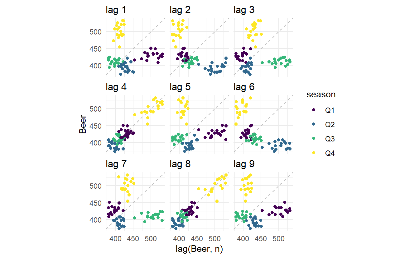
It’s no surprise that strong relationship is detected for \(k = 4\) and \(k = 8\), since in these 2 panels data points are collected from the same quarter, and from this pattern strong seasonality of beer production can be found.
2.7.1 Autocorrelation
Just as correlation measures the extent of a linear relationship between two variables, autocorrelation measures the linear relationship between lagged values of a time series.
There are several autocorrelation coefficients, corresponding to each panel in the lag plot. For example, \(r_1\) measures the relationship between \(y_t\) and \(y_{t−1}\), \(r_2\) measures the relationship between \(y_t\) and \(y_{t−2}\) and so on.
The sample correlation coefficient (pearson) is defined as:
\[ r_{x, y} = \frac{\sum{(x_t - \bar{x})(y_t - \bar{y})}}{\sqrt{\sum{(x_t - \bar{x}})^2} {\sqrt{\sum{(y_t - \bar{y}})^2}}} \]
given \(x_t = y_t\) and \(y_t = y_{t-k}\) we get the autocorrelation coefficient:
\[ r_k = r_{y_t,y_{t-k}} = \frac{\sum{(y_t - \bar{y})(y_{t-k} - \bar{y})}}{\sum{(y_t - \bar{y})^2}} \]
The autocorrelation coefficients make up the autocorrelation function or ACF.
The autocorrelation coefficients for the beer production data can be computed using the ACF(.data, lag_max) function, with lag_max defaulting to \(10 \times \log{\frac{N}{M}}\) where \(N\) is the number of observations and \(M\) the number of series..
recent_production %>% ACF(Beer)
#> # A tsibble: 18 x 2 [1Q]
#> lag acf
#> <lag> <dbl>
#> 1 1Q -0.102
#> 2 2Q -0.657
#> 3 3Q -0.0603
#> 4 4Q 0.869
#> 5 5Q -0.0892
#> 6 6Q -0.635
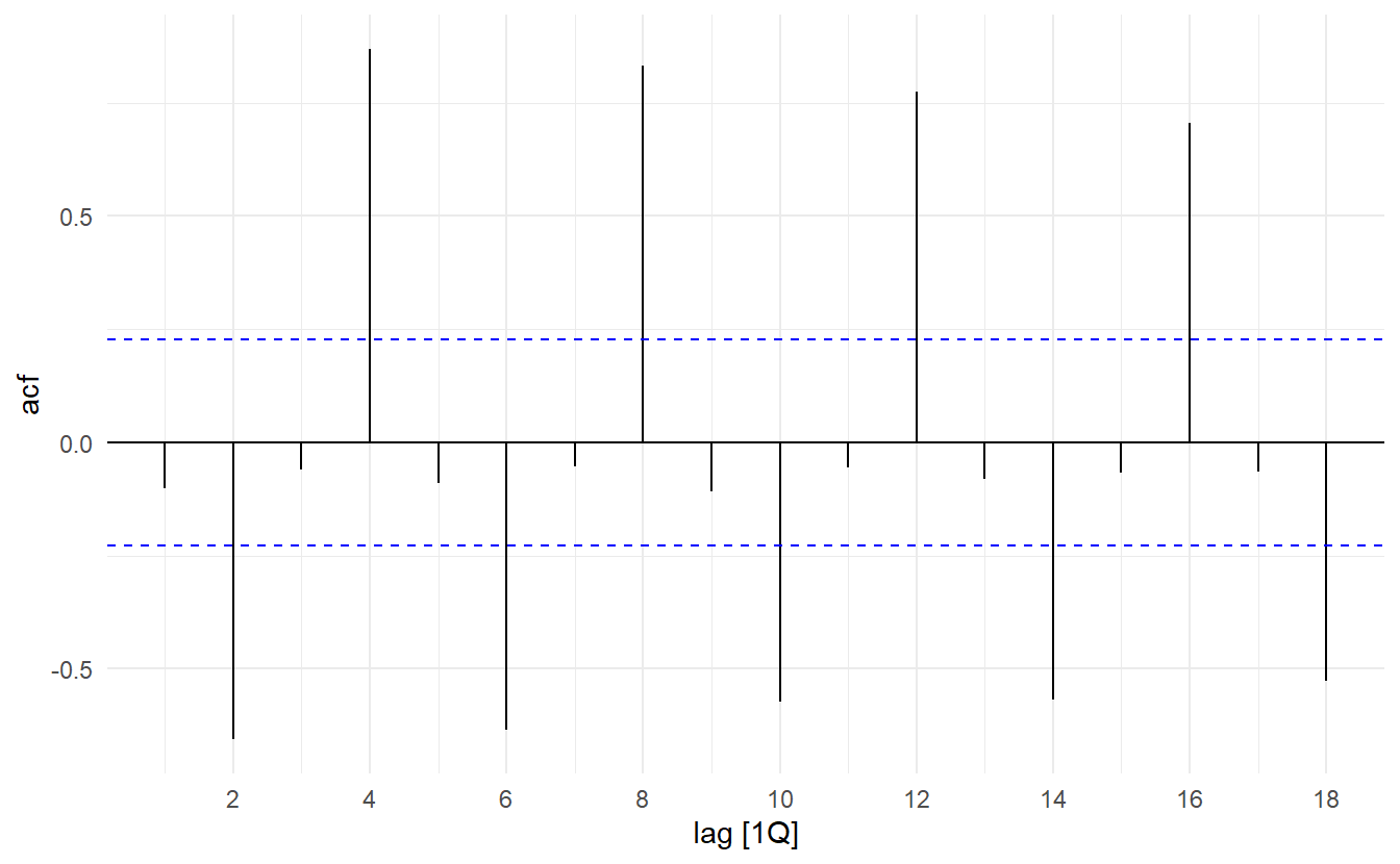
#> # ... with 12 more rowsSimilarly, the ACF() result could be plotted by autoplot(), which is oftern referred to as correlogram:
In this graph:
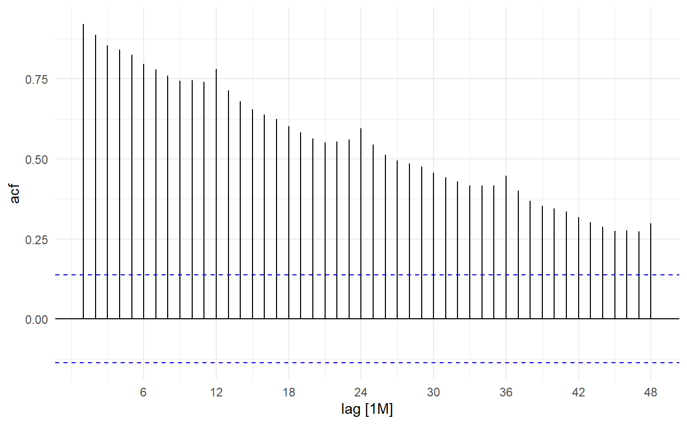
- \(r_4\) is higher than for the other lags. This is due to the seasonal pattern in the data: the peaks tend to be four quarters apart and the troughs tend to be four quarters apart.
- \(r_2\) is more negative than for the other lags because troughs tend to be two quarters behind peaks.
- The dashed blue lines indicate whether the correlations are significantly different from zero.
This seasonal pattern could also be visualized by `gg_season()``
2.7.2 Trend and seasonality in ACF plots
When data have a trend, the autocorrelations for small lags tend to be large and positive because observations nearby in time are also nearby in size. So the ACF of trended time series tend to have positive values that slowly decrease as the lags increase.
When data are seasonal, the autocorrelations will be larger for the seasonal lags (at multiples of the seasonal frequency) than for other lags.
When data are both trended and seasonal, you see a combination of these effects, as shown below in the case of a10.
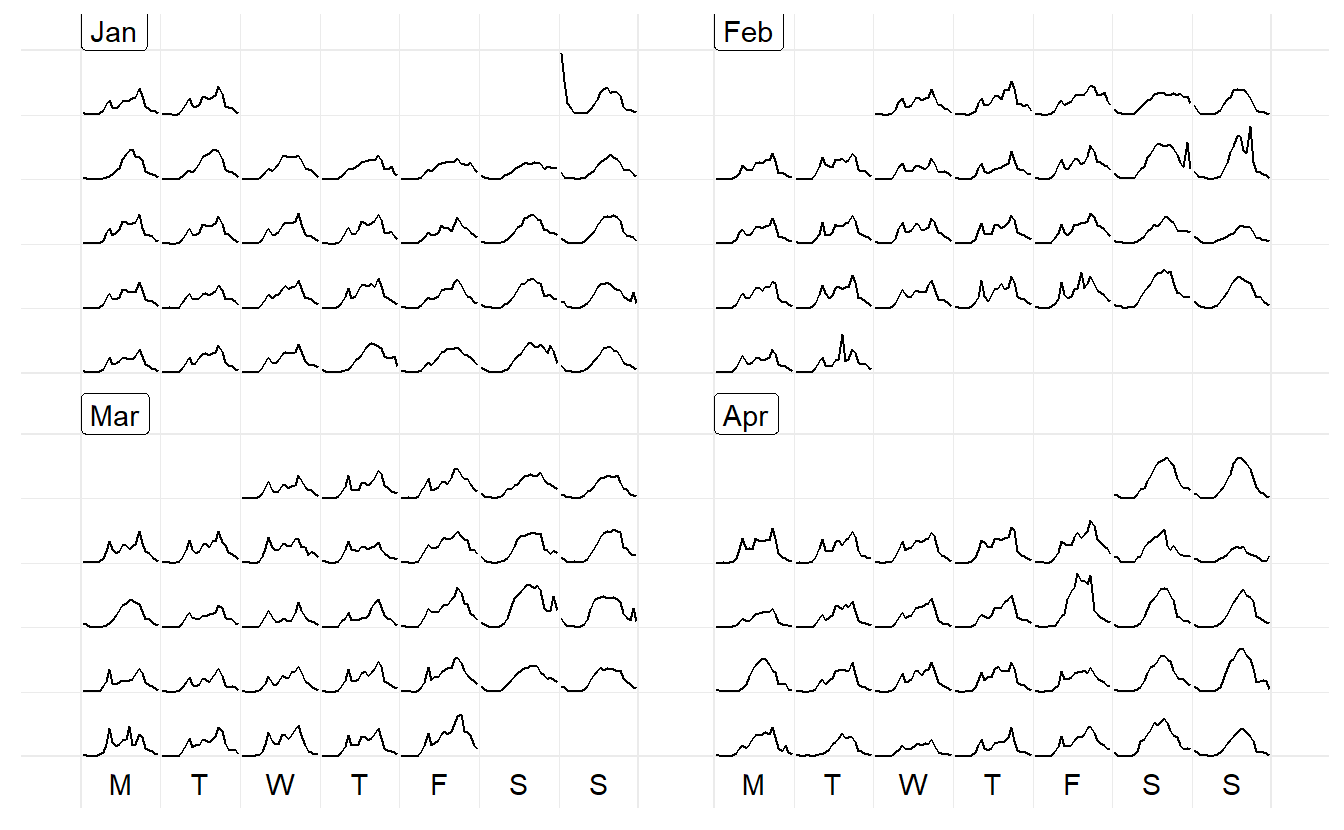
2.8 Calendar plots
Calendar-based graphics arranges the values according to the corresponding dates into a calendar layout, which is comprised of weekdays in columns and weeks of a month in rows for a common monthly calendar. In sugrrants the built-in calendars include monthly, weekly, and daily types for the purpose of comparison between different temporal components.
facet_calender() lay out panels in a calendar format, and a monthly calendar is set up as a 5 by 7 layout matrix
hourly_peds %>%
  filter(Date < ymd("2016-04-01")) %>%
  ggplot(aes(x = Time, y = Hourly_Counts, colour = Sensor_Name)) +
  geom_line() +
  facet_calendar(~ Date) + # a variable contains dates
  theme_bw() +
  theme(legend.position = "bottom")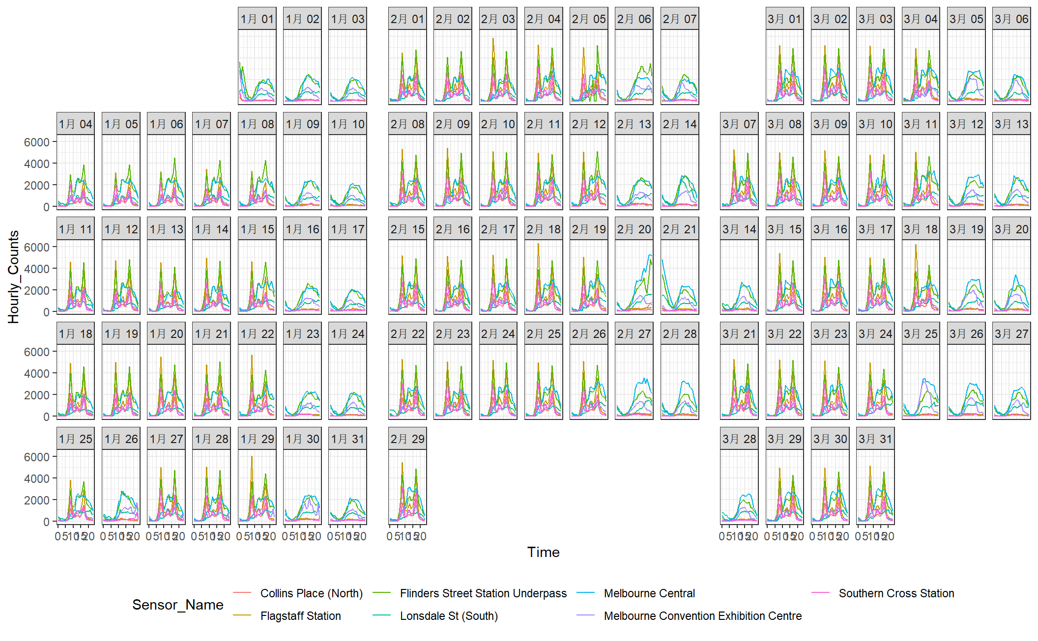
In contrast, frame_calendar() display calendar plot not by facetting, but by computing a more compact calendar grids as a data frame or a tibble according to its data input, and ggplot2 takes care of the plotting as you usually do with a data frame. This is a faster, more flexible alternative.
Note center is just a normal tibble:
# sensor only–Melbourne Convention Exhibition Centre
center <- hourly_peds %>%
  filter(Year == "2017", Sensor_Name == "Melbourne Convention Exhibition Centre")

center
#> # A tibble: 2,880 x 10
#>   Date_Time           Date        Year Month Mdate Day    Time Sensor_ID
#>   <dttm>              <date>     <dbl> <ord> <dbl> <ord> <dbl>     <dbl>
#> 1 2017-01-01 00:00:00 2017-01-01  2017 Janu~     1 Sund~     0        25
#> 2 2017-01-01 01:00:00 2017-01-01  2017 Janu~     1 Sund~     1        25
#> 3 2017-01-01 02:00:00 2017-01-01  2017 Janu~     1 Sund~     2        25
#> 4 2017-01-01 03:00:00 2017-01-01  2017 Janu~     1 Sund~     3        25
#> 5 2017-01-01 04:00:00 2017-01-01  2017 Janu~     1 Sund~     4        25
#> 6 2017-01-01 05:00:00 2017-01-01  2017 Janu~     1 Sund~     5        25
#> # ... with 2,874 more rows, and 2 more variables: Sensor_Name <chr>,
#> #   Hourly_Counts <dbl>
The first argument in frame_calendar()is the data so that the data frame can directly be piped into the function using %>%. x is a variable indicating time of day could be, y a value variable, date a Date variable to organise the data into a correct chronological order
In center, we have 24 Hourly_Counts observations per day, with the day indicated by Date, and time in that day by Time, \(\text{Time} = 1, 2, \dots, 24\). So x = Time, y = Hourly_Counts, date = Date. We also use calendar = "monthly" to specify a calendar type, this could also be “weekly” or “daily”
center_calendar <- center %>%
  frame_calendar(x = Time, y = Hourly_Counts, date = Date, calendar = "monthly")
This generates two new columns .x and .y, in this case .Time and .Hourly_Counts. This two columns together give new corrdinates computed for different types of calenders. date groups the same dates in a chronical order which is useful geom_line() and geom_path(). The basic use is ggplot(aes(x = .x, y = .y, group = date)) + geom_*
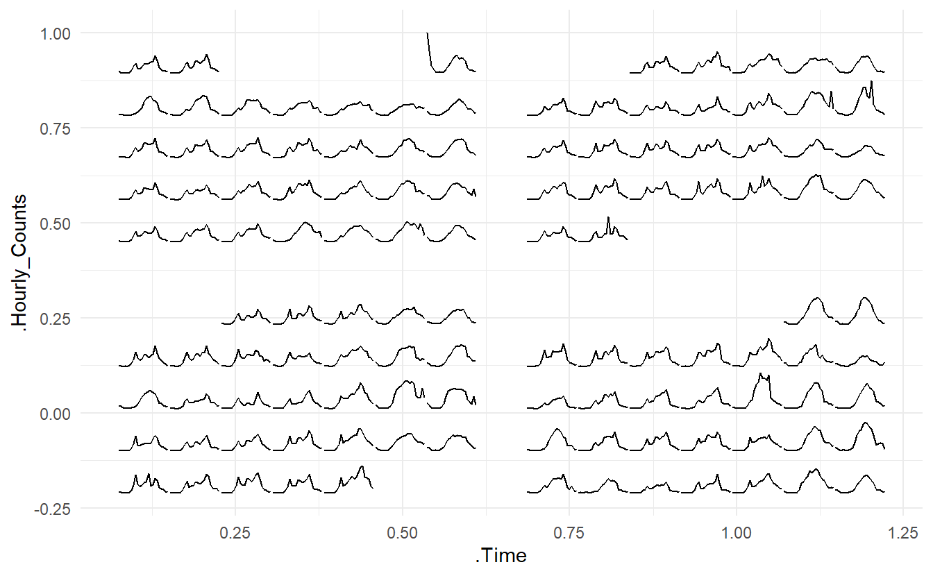
prettify() can be used to make the former plot more informative. It takes a ggplot object and gives sensible breaks and labels. It can be noted that the calendar-based graphic depicts time of day, day of week, and other calendar effects like public holiday in a clear manner.
It’s not necessarily working with lines but other geoms too. And y can take multiple variable names in combination with vars(). The rectangular glyphs arranged on a “weekly” calendar are plotted to illustrate the usage of the multiple ys and the differences between sensors.
two_sensors_wide <- hourly_peds %>%
  filter(year(Date) == "2017", Sensor_Name %in% c("Lonsdale St (South)", "Melbourne Convention Exhibition Centre")) %>%
  select(-Sensor_ID) %>%
  pivot_wider(names_from = Sensor_Name, values_from = "Hourly_Counts") %>%
   rename(
    Lonsdale = `Lonsdale St (South)`,
    Centre = `Melbourne Convention Exhibition Centre`
  ) %>%
  mutate(
    diff = Centre - Lonsdale,
    more = if_else(diff > 0, "Centre", "Lonsdale")
  )

p2 <- two_sensors_wide %>%
  frame_calendar(x = Time, y = vars(Lonsdale, Centre),
                 date = Date, calendar = "weekly") %>%
  ggplot(aes(.Time, group = Date)) +
  geom_rect(aes(
    xmin = .Time, xmax = .Time + 0.005,
    ymin = .Lonsdale, ymax = .Centre, fill = more
  )) +
  scale_fill_manual(name = "Which sensor spotted more pedestrians?",
                    values = c("#798234", "#d0587e")) +
  theme_minimal() +
  theme(legend.position = "top")


prettify(p2)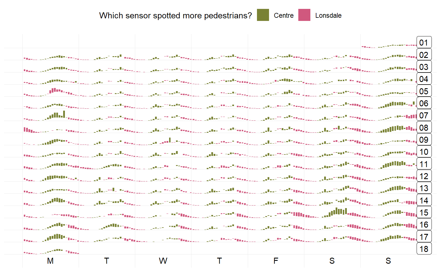
More information in Package vignette